A couple of years ago, I read the book The Best Interface Is No Interface, by a man who calls himself Golden Krishna. Mr Krishna is a UI/UX specialist who consults several big companies on how to design their UI. While most UI/UX specialists get paid based on the number of screens / UI components they design, Golden Krishna gets paid based on how many UI components he eliminates from an application. Sounds contradictory, but true. Why?
This is because the golden boy of UI is eliminating unnecessary work and saving development time for companies. His consult on making less UI and screens is taken seriously and as a result companies make small, light-weight and easy to use applications.
The book led me to think of so many occasions where companies I worked for could have reduced the number of UI components and the obsessions with their immaculate looks. They could have rather worked to eliminate so many inputs, thereby truly enhancing the user experience. Sure, a user loves to look at well-designed screens, colours and fonts. Yes, people love to drool at any device with the prefix ‘i’, because they look great. But the drooling and admiration have a limit. Beyond that limit, the user feels annoyed. They hate having to look at and swipe through a huge deck of screens and typing or selecting inputs in them. In the end, they’d prefer not having to interact with a device’s screen. They’d rather have devices and applications that have few or no screens, but still make their work simple.
In this post, I offer some tips to steer clear of multiple screens that the user has to wade through.
Use the device’s sensors when available.
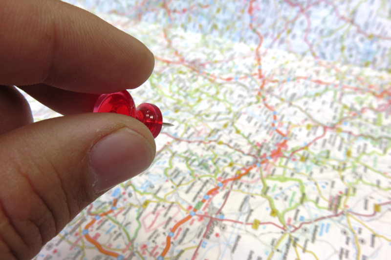
You must have surely come across apps and websites that start with a set of questions that make you roll your eyes. Please choose your country, please enter your city, please drop a pin on the map… and so on. Screen after screen goes before you can get to what you opened the application for. It can be exasperating.
If getting the user’s current location is the goal, it is better to assume that the user is ready to share his/her location readily. Most people talk about user privacy, but only the paranoid ones see location detection as a genuine threat. They’d rather have the device work out where they are.
Instead of a deck of screens, detect the user’s location and present a reasonable estimate directly on the screen where the user wants to start his/her work. E.g. if you are showing the user the nearest fuel stations, then pick his / her location and start the application on the map page already.
If the user hasn’t provided access to location detection, then you should first ask for permission. Only if one of two things happen should you revert to the deck of input screens. The first is if the user refuses permission for using sensors. The second option should be on the home screen of the app. If the wrong location was detected, then a button such as ‘No, this is not where I am’, should take the user to the deck of screens, so that he/she can override the sensor.
This should be true for all sensors. If you are the author of a sports app, you should be detecting walking, running, swimming, riding, etc. through the app without having to prompt the user. This is where Google Fit has an edge over an app such as Endomondo. Although Endomondo’s statistics are more accurate and the app is more engaging, I find it a pain to have to start the app and key in some inputs before I can start my workout. Google Fit automatically records everything and lets me change things in the recorded information later. If I want, I can suppress Google Fit from recording things. This is true for most fitness bands too.
Integrate with an interface that the user is habituated to.
Vodafone India has been sending me on a multi-screen chase for the last few years. Recently they upped the ante to annoy me even further. Here is the story.
Vodafone regularly sends me the latest bill for my postpaid phone connection. The payment is automated through my bank. Whenever my bank makes the scheduled monthly payment, I receive an email and an SMS from the bank that a certain amount was debited for my connection. Vodafone doesn’t reveal a clue on whether they received the payment or not.
So, what do I do? Here’s what my workflow used to be. Giving my bank and Vodafone 3 days to settle the dues, I would log into my account on Vodafone’s website. On the website it usually showed that the payment was successful. Phew! So much to verify whether Vodafone received payment. But wait, it doesn’t end there.
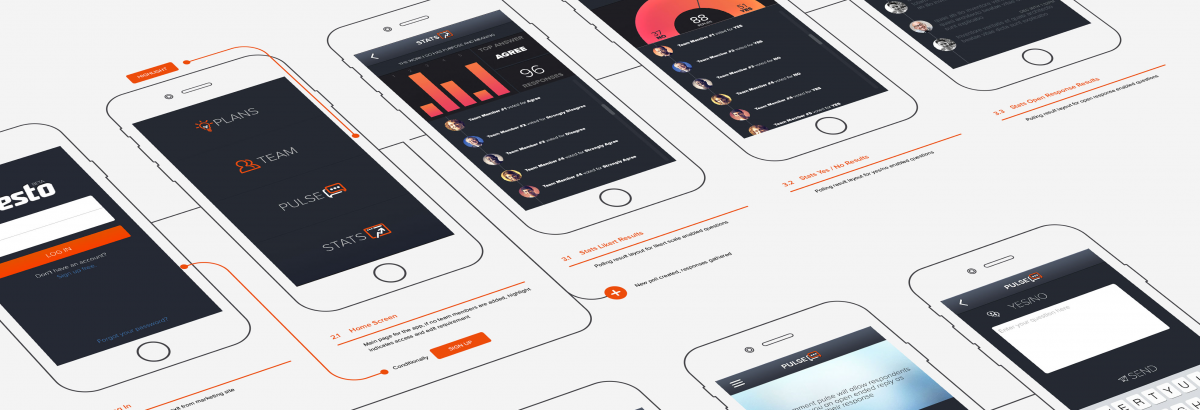
One fine day towards the end of 2019, Vodafone’s website presented me with a screen that said that ‘Manage Account’ section was moved to the mobile app! What? I need to download your app from the Play Store so that you will show me if you have received your dues? With a huge sigh and seeing no other option, I installed their app. An app? Yes, you know, a piece of software with MORE SCREENS.
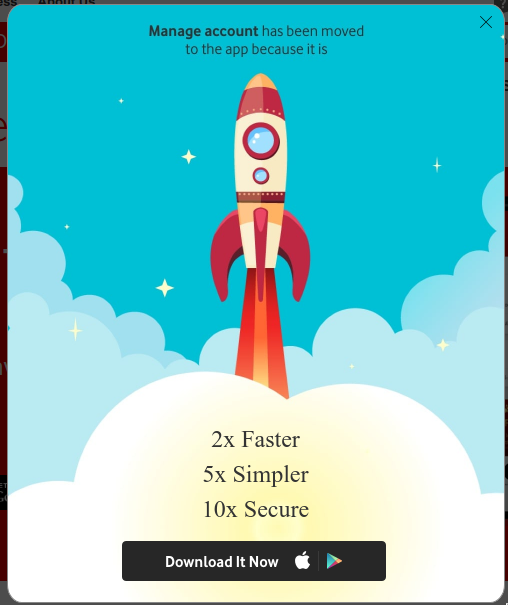
At the least, Vodafone can courteously send me a communication on an interface I already use everyday as a habit, say an email or an SMS. Instead, they make me download an app and wade through screens just to see if I have successfully paid their monthly bill!
Don’t be Vodafone! Whenever possible, integrate into a user’s daily habit instead of sending them to more apps, more screens and more inputs. Are you a newspaper? Send the salient news articles directly to the user’s inbox. Don’t expect him/her to log into your website or open your app everyday. The user may be reading 4 – 5 newspapers. Don’t make them open a new deck of screens for each until they really need a new screen. Think about it. Do you want vanity metrics like more eyeballs on an app screen or real metrics like more satisfied users using your service?
Don’t make motorists look away from the road.
While looking at more screens for the above two points are simply annoyances, doing so for this point is dangerous. Stop making motorists look at your app’s screens while driving. But why won’t they pull over to the kerb and look at my app? You see, those who drive a car are usually bound to momentum and wouldn’t want to stop their vehicle and pull over just to respond to more screens in an app. An illusion of multitasking makes them use your application and drive at the same time.
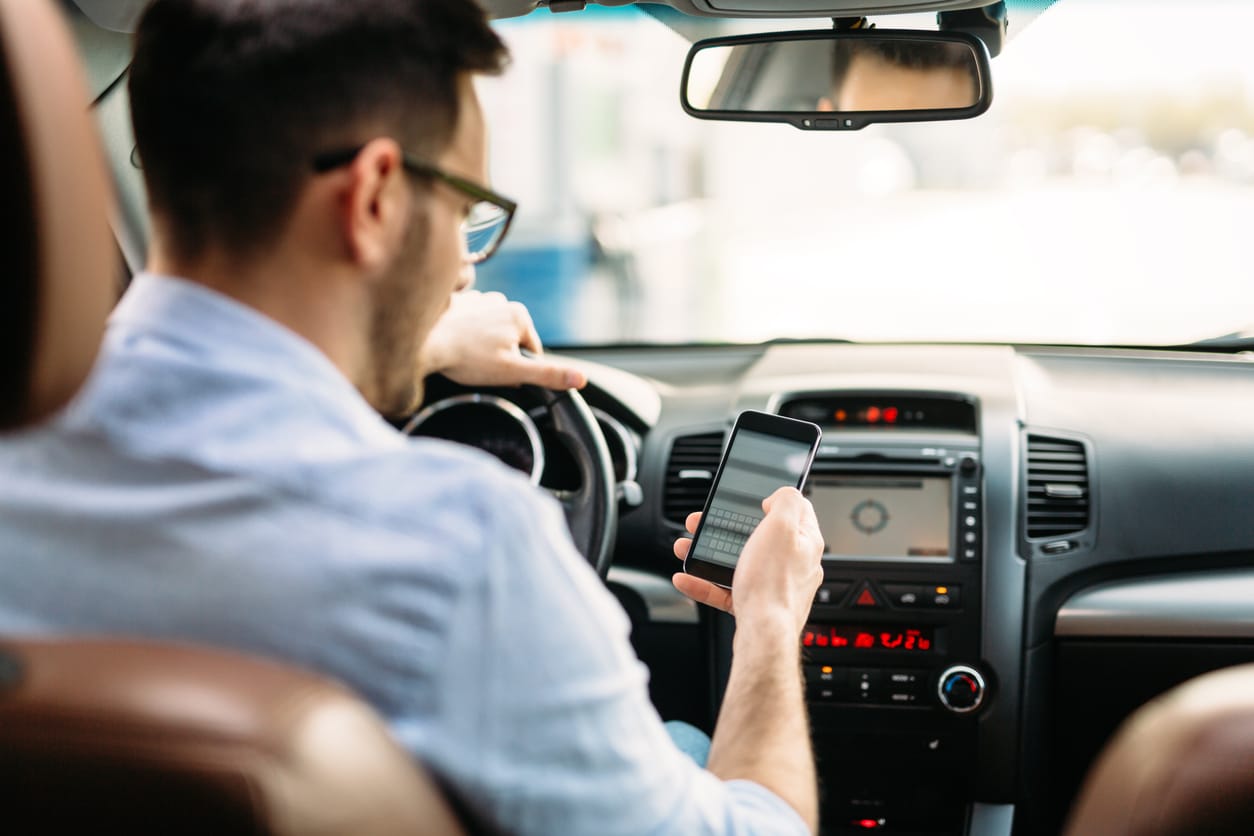
I loved Waze app, but stopped using it after 2014. Everytime I wanted to contribute something to the app, such as a road block or an accident, I’d have to peel my eyes off the road and tap away on a couple of screens to make entries. It was perilous for me and for others on the road. Waze didn’t have elegant solutions like, “Ok Waze, there is roadblock 100 metres ahead”. “Ok, marking a roadblock 100 metres ahead.”
When engaging with a motorist, try to use voice control, speech detection, hand gestures, etc. If the application is going to run on a device inside the car instead of a smartphone / tablet, then consider making extra knobs / buttons on the dashboard and engaging with the car’s circuitry using hardware protocols such as CAN (Controller Access Network).
Don’t offer help unless asked for.
My fingers are pointed towards all the apps that shove an overlaid help section down the user’s throats. The user lifts a finger to use the app when suddenly, a set of overlays start floating over the very buttons, tabs and inputs that the user wants to use. This menu does this, this button does this and so on. The user, who isn’t looking for help, starts tapping and swiping away to make the annoying floating text and shapes go away, but the sequence of help tips doesn’t seem to end. After eternity, the user is allowed to do his/her work.

What if your app simply had a link or a button named ‘May I help you?’ in prominent colours and font, but still out of the user’s way? Application design, whether web or app, follows a standard layout these days and most users, especially millennials, just get it.
Offer the very basic features without authentication.
Only a certain category of apps require that you log in as the first thing to be able to access the features. Banking is a legitimate example. Online shopping is not and in fact, all shopping apps get it right. You can always browse through products without having to log in. It is only when you need access to a shopping cart that you are asked to log in. In fact, some shopping applications maintain the shopping cart throughout a browsing session without asking the user to log in. Only the payment stage is used for authentication. The application lets the user work by moving out of the way until the user wants to access a service specific to him / her.
One example of an application which doesn’t get the design right is the Indian Railways ticket booking application, IRCTC ticketing. Ideally, I would want to search for trains and ensure that berths are available before I choose to even login. If no seats / berths are available, I’d just close the application and move on.
Another caveat of this approach, where I have to log in even to search, is that the pages are not indexable by Google. If I were to search for a train number or name on Google, Google is unable to show IRCTC’s results for the train and take me directly there. So what’s the consequence. I need to open IRCTC’s app or website first and go through their screens to find my preferred train.
In contrast, search results for a product or a destination from Amazon shopping and MakeMyTrip appear directly on Google’s search results and I can jump right to the page where I can view product / service information and buy.
Avoid a screen at all if possible.
Do you even require a device with a screen for the job? Devices like FitBit, Nest, Alexa and Google Home have worked for nearly a decade without a physical screen. Sure you need a device with a screen to configure them, but most of the configuration is one-time or once in a while.
Voice control, WiFi signals, Bluetooth signals, sensors and speakers are all it takes to control these devices. The user hardly looks up from what he / she is doing. The working of these devices is triggered by time schedules, voice commands or even through one service talking to another via a system such as IFTTT.
RFID chips, Bluetooth Low Energy beacons, GPS and technologies like ZigBee have been used extensively by several companies to make their systems aware of someone or something’s location and context. Chips are fitted to products, to the trucks that ship them, to the clothes of persons or animals who are being tracked and to gates and portals which need to track what’s going on between them. Why use standard screens with credentials for authentication when one can use biometrics such as iris scan or fingerprint scan?
Today, we are in a world where proactive technology is more pervasive than ever before and they should be in charge of inputs. Why should we still make applications where the user needs to navigate screens and enter tons of information himself/herself?
Conclusion
We were excited in the end of 1990s when we left the world of command line terminals and entered the world of pervasive GUI. Then came capacitive touchscreens which made mobile phones easy to use, without having to tap away on buttons on an old Nokia.
But along the way, we got carried away and put in too much user interface. So much that applications are annoying to use. They present the users with too much UI that are not necessary. Users are forced to enter more inputs in the form of typing, swiping, tapping, flicking, dragging, etc.
Maybe it is time for us to step back and like Golden Krishna, determine if the best UI is one with no UI.