My wife Priya and I went on a year-long trip named India 360. We clicked tens of thousands of photos during the trip. We share them on our Facebook page and Instagram channel. But, we realised that the quality of the photos we shared weren’t high. Sure, the resolution was great and the most of the photos were good. But we weren’t getting the photos to look like what professional travel photographers do.
Late last year we met Aravind, my brother-in-law (Priya’s brother), who is an excellent photographer. He is also good with post-processing using software tools like Snapseed and Lightroom. In a span of half an hour, Aravind taught me how to make my travel photos look good…. really good. He didn’t fiddle with gimmicky settings, nor use jargon. He taught me 5… just 5…. steps that make every photo look great after post-processing. There was a bonus 6th step which should be used sparingly.
Since then, I have learnt from his principles and edited 100s of photos from our travel, making them look much better than the original shot. I even added some steps of my own to the process. I edit my photos from two places. On my Android phone, I use an app called Snapseed. I use neither Mac OS, nor Windows. On Ubuntu Linux, Adobe Lightroom doesn’t work. So my desktop photo-processing app of choice is Gimp.
What I cover in this post?
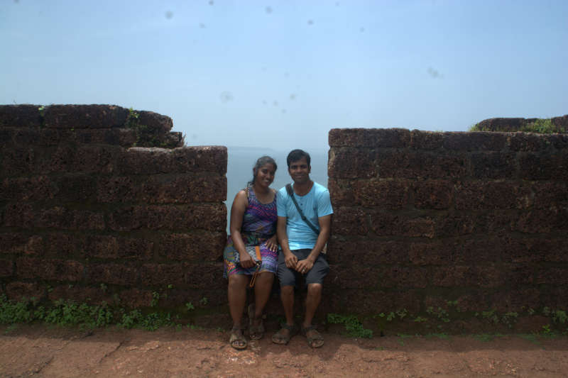
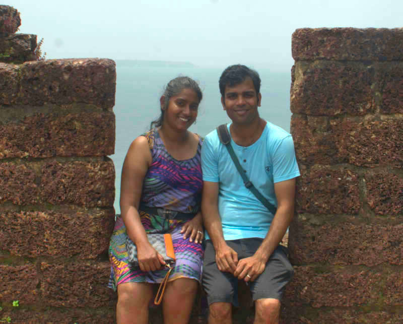
In this post, we are going to walk through the steps on a sample photo. In this photo, my gorgeous wife Priya (I am so blessed to have her in my life 🙂 ) and I are sitting on the fortification wall of a fort named Aguada in the Indian state of Goa, with the sea in the background. The photo is already very cute, but there is a lot to be done before it can be called fantastic.
The original photo has a 24 megapixel resolution, but for quick loading on this web page, I will use downsized samples measuring at most 800 pixels in width. Our app of choice for the demo will be Snapseed on Android. But the same tools can be found under different names in different photo-processing applications.
Here are the steps to make your photos look good in less than 5 minutes.
Framing
The first step in making a photo look good is that you must retain only whatever you want the viewer to see and eliminate the extras. There must be one subject that stands out, while everything else is just a prop that provides context.
In our sample photo, the two of us, who are the main subjects of the photo, are dwarfed in comparison to the other things that compete for attention — the fortification wall, the floor of the fort (which has no value in the photo), the sky and the sea.
The first tools we use on any photo are the crop and rotate tools. The crop tool can be used to cut out extras and give as much space to the main subject as possible. In our photo, the two of us should occupy as much area as possible. We should not eliminate the props, but retain a little bit of them to give context, i.e. we are sitting on the wall of a fort adjacent to the sea. To make our faces — and smiles — appear larger, we can even cut out the floor of the fort, and with that, our feet. Upto our knees are all we need. We aren’t wearing any stand-out footwear that must be part of the photo.
For some photos, the rotate tool is necessary. Some people hold the camera tilted, either by mistake or on purpose. To make the photo look natural, we should get rid of tilted angles. The horizon should be horizontal and the fort walls with our sitting posture should be upright. We can use the rotate tool to fix any tilted angles that make the photo look sloppy.
There. With the crop and rotate tools, you can see that the photo looks so much better already.
In Snapseed,
The crop tool can be found in Tools -> Crop.
The rotate tool in Tools -> Rotate.
Adjusting white balance
Depending on the time of the day and lighting, the camera can see more red or more blue colour than in the original frame. Pure whites will appear slightly reddish or bluish. This affects other colours in the frame too, as the overall hue can appear too red-heavy or blue-heavy. This can be fixed using the tool to adjust white balance.
Granted that we are near the sea and the sky and that we are wearing blue attire. But the picture has too much blue. It is bluer than normal. This is evident if you see the colour of my tee shirt. It seems to glow with too much blueness!
In the white balance adjustment tool, you can drag a slider towards the red colour if your photo is too blue and vice versa.
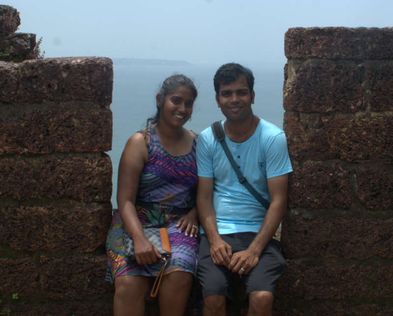
Here is the photo in more natural tones.
In Snapseed,
White balance can be found in Tools -> White Balance. Thereafter you can swipe left or right on the picture to add / reduce blueness / redness.
Shadows and highlights
Lighting is essential in order to make objects appear in photos. But lighting from the wrong direction can work the opposite way by hiding objects. Why? It causes opaque objects in its path to cast shadows. It is possible that your photo’s main subject is obscured by shadows.
In the sample photo, shadows are not playing spoilsport by hiding our facial features. But they are working to make us appear darker than we usually are. Sure, a week in Goa can give you a pretty deep tan, but that is not what you see in this photo. It is the shadow of a fort wall to our right with the sun behind it.
This can be easily fixed by using the Shadows tool. Dragging the slider in one direction further darkens the photo, while the other direction brightens the photo. Behind the scenes, the shadows tool is simply adjusting the brightness of the photo and applying a few calculations to make it look natural.
The shadows tool has a side effect. It causes some delicate details to disappear, hidden by the extra brightness. An example would be that if you brighten the sky too much, then you’ll see one bright monotonous canvas and lose the details of the clouds. To combat this, there is a corresponding ‘hightlights’ tool. This tool changes the contrast such that it offsets the effects of the brightness to some degree.
It is a fine dancing act to get the correct setting of shadows and highlights. Lot of trial and error needs to be done to get it just right. Thankfully, all the tools have a live preview as you adjust the slider.
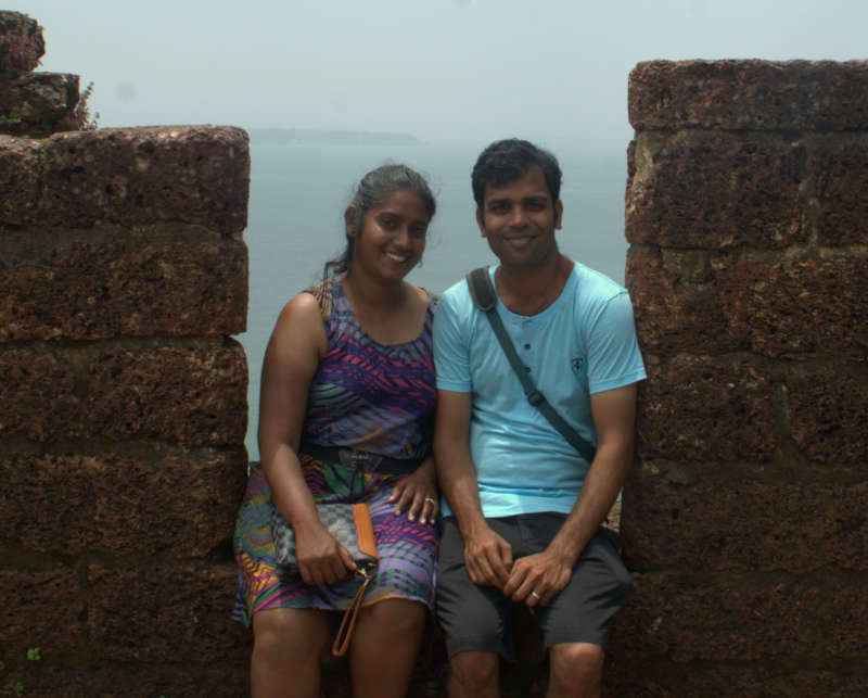
Here is the result of adjusting the two settings in our photo.

Compared to the last photo, you can see considerable light on both us and the fortification wall on which we are sitting. The shadows tool caused the sea behind us to blur considerably, but using the highlights tool restored it to some degree.
In Snapseed,
Both tools is in Tools -> Tune Image.
Once inside ‘Tune Image’, swipe up and down. You will see a menu that shows tools that are classified under ‘Tune Image’. Both ‘Shadows’ and ‘Highlights’ are part of this menu.
Saturation
Sometimes the camera lens fails to capture the full range of colours in a scene. This may be due to the wrong ISO setting, too much light or too little light. The best colours are captured in an early morning or early evening sun or by the controlled electric lighting inside a room. Harsh light in afternoon or faint light during dusk can cause loss of colours.
The saturation tool can help restore colours in a photo. This process is also referred to in post-processing as ‘popping’, i.e. making objects in the photo pop out as the colours get more defined. The saturation tool must be used very carefully and sparingly. Too much saturation can lead to annoyingly popping colours and fakeness in the photo.
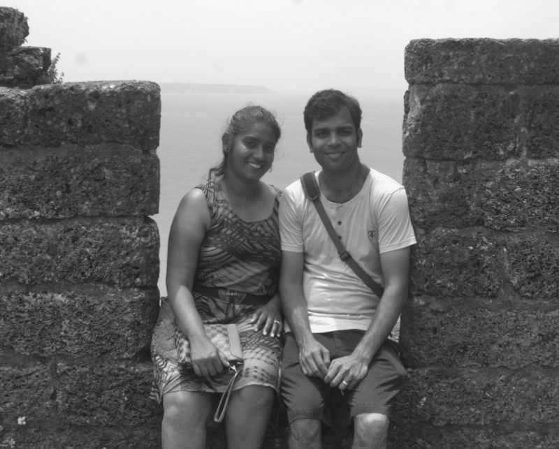
The saturation tool can also be used to ‘desaturate’ photos, which means to intentionally make photos black and white. This can be used to show timeless pieces such as monuments, or on elderly people.
Even if your photo’s colours look alright, a quick slide on the saturation tool can show you other levels of saturation, which you may find attractive. You can always undo your last tool’s effect.
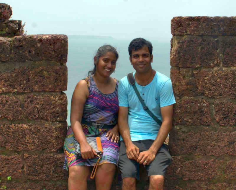
Here is the saturation level I am satisfied with for our sample photo.
And here is a sample using desaturation.
Saturation tool can also be found under Tools -> Tune Image. On swiping up / down, one of the options is saturation.
Details / sharpness
Depending on how your camera’s focus or aperture was set while taking the photo, you may see clear lines and sharp features or unfocused and blurry features. It may be useful to run the sharpness tool on your photo just to look at the effects and see if a better version with cleaner lines is possible.
Here is our sample photo after adjusting sharpness.
 In Snapseed, setting sharpness / blurriness is called structuring. It can be found under Tools -> Details. Once inside the details screen, you should swipe up / down. You will see the ‘Structure’ option inside the menu.
Vignetting
This tool is used to create a spotlight over your photo. It creates an area, usually circular or oval with a radius, that appears brighter than the rest of the photo, Outside this spotlight, the brightness tapers off in a gradient fashion, with the edges of the photo appearing significantly darker than the spotlight. The shape and the dimensions of the spotlight can be set.
This tool is used to draw the attention of the viewer to the main subject, while drowning the distractions in darkness. But the effects of this tool will be funny if used improperly. As far as possible, use cropping to cut out distractions, rather than darken them with a vignette.
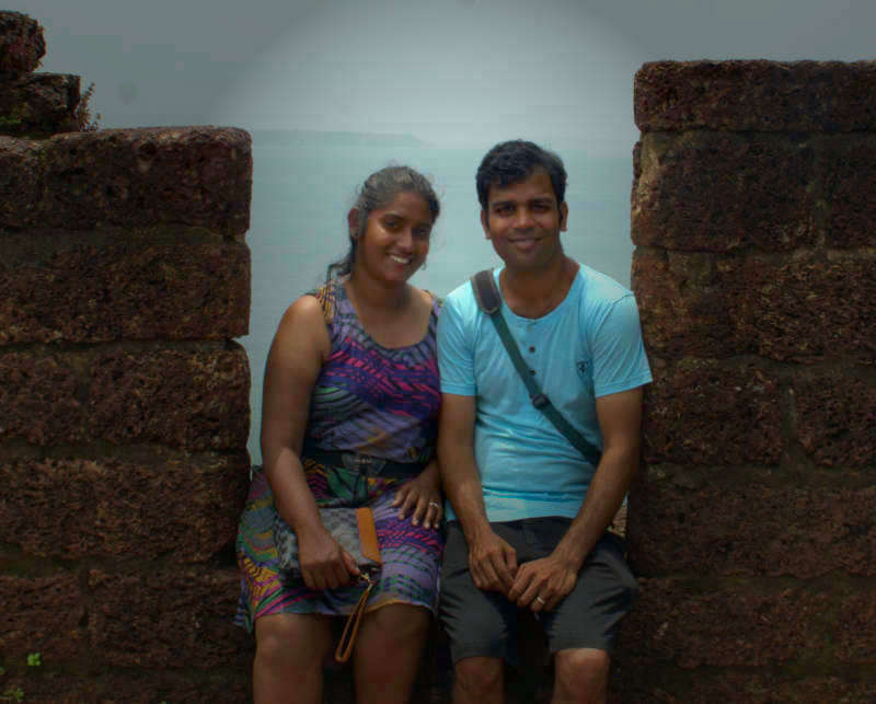
Our sample photo does not need vignetting, but here is what it would look like. I have included this photo for the sake of completeness of the post.
As you can see, vignetting didn’t work well in our sample photo, but here is another sample where it worked extremely well.
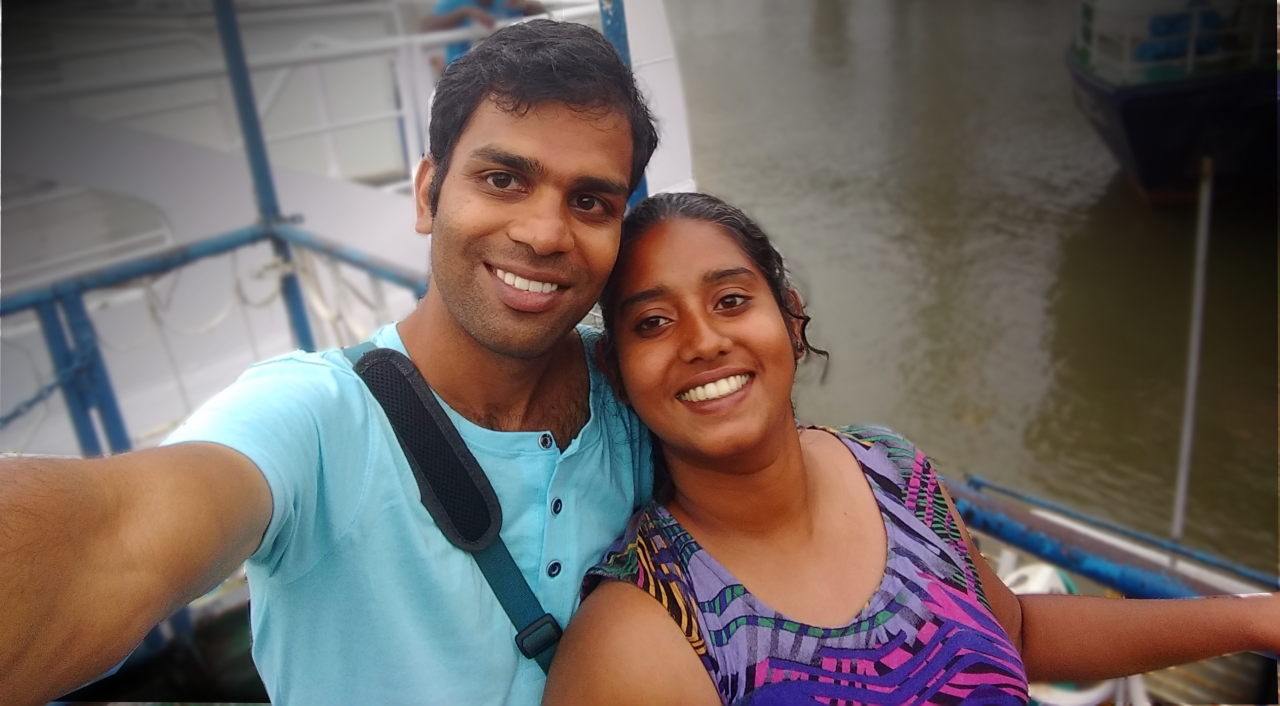
The vignetting has cast a shadow over the river water and distractions like the other ferry and the railings behind us. It shines a spotlight on our faces and draws the viewers’ attention immediately.
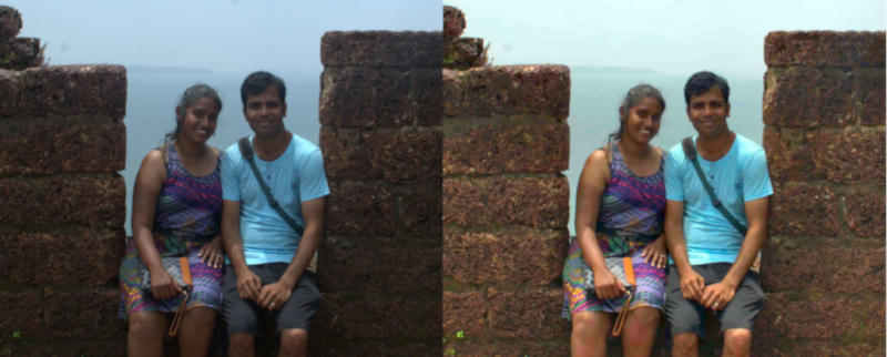
Before – After
Just like any detergent wash commercial, I present to you the ‘before’ and ‘after’. You can see the difference quite clearly. The effects of vignetting are not included.
I’ll let you be the judge of which photo is better and by how much it is better.
How much time does it take?
While you are learning the ropes, each photo can take upto 10 minutes. But once you get a hang of it, a two-minute job does the trick.
Conclusion
While it pays to take good photos right from the outset, it may not be possible due of time constraints or because you don’t have the right light or the right gear for the moment. But post-processing with the above principles makes most photos look so much better and you’ll be happier with your photo collection which will inevitably get more ratings.