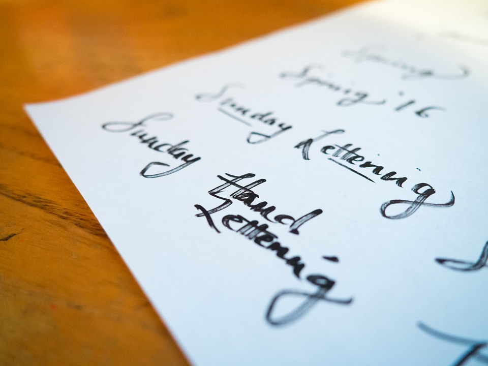
Your writing has a distinct style. There is a way in which you shape the letter ‘a’ that is unique to you. This is true for every letter and number you write. Your writing style is formal and measured when you are writing a proposal for your company or filling a government form. It is totally different, very casual, when you write a love note to your spouse. It may turn chaotic when you are simply scribbling ideas on a notepad, post-its or a napkin. One way or the other your writing style changes depending on the application. Also, your style of writing differs from your friends’s, boss’s or spouse’s style. It is unique to you.
The same idea is captured in the digital world in the form of font. A particular font is suited for a particular application. E.g. sans serif fonts for websites, serif fonts for newspapers and mono space fonts to represent engineering codes or mathematical formulae. And then, there is one font that is good for you. It appeals to your taste or represents your character.
Let’s dive into the world of fonts in this post and find out how they work.
Font vs typeface
Before we discuss fonts, let me dispel the biggest myth about fonts in the world. When people talk about fonts, they are talking about ‘Arial’ or ‘Times New Roman’ and the like. Let me stop you right there. You’d be talking about typefaces. Typefaces are the ones that go by different names. Fonts are variations within the same typeface. Variations usually include a regular version, a bolder version, an italicised version, etc. In that case, ‘Arial Regular’ and ‘Arial Bold’ are different fonts, while ‘Arial’ and ‘Times New Roman’ are different typefaces.
Sans Serif font
Sans Serif bold font
Sans Serif italic font
Two different fonts within the same typeface are stored in two different files. A file for Arial Bold and one for Arial Italic are different. The two have the same letters as the regular form, but with letters made bolder and slanted. If you were to delete the file for Arial Bold or Arial Italic, and then click the ‘B’ or ‘I’ button in Microsoft Word on a sentence made with Arial font, then the sentence will not become bold or italicised at all.
What is TrueType?
In the 1980s, Xerox were the first company to work on fonts to represent different letters of the alphabet in different styles. Later, Adobe took the bar higher by making several fonts for use in their graphic design packages. Apple and Microsoft were ready with their GUI software and wanted to include several fonts in their operating systems. Using fonts from Xerox and Adobe meant paying several royalties for each copy of their OS sold. So the two companies joined forces for a while to work on fonts.
Microsoft was successful in making fonts for use on Windows. Fonts by Xerox, Adobe and Microsoft were bitmaps. Meaning that the letters in their fonts were a series of dots, usually in a 32×24 matrix. To make shapes such as ‘a’ or ‘b’, the matrix would have an array of black dots representing the strokes of the letters against a plain background. The disadvantage was that the letters looked good as long as the size of the text stuck to a height of 24. But they looked pixelated when the font size was increased. To alleviate this, the company made multiple font files for different sizes of the letters.

But Apple took things further with the invention of TrueType fonts. In TrueType fonts, the letters are represented by geometric instructions instead of a matrix of dots. So to draw ‘A’, there would be instructions to draw two slanted lines at appropriate angles and join them with a horizontal line. In the Mac OS, there was a component called the rasteriser that would take the instructions and convert them into pixels just before drawing to the screen. It didn’t matter how much you scaled the letters, you were just scaling the sizes of the strokes in the instructions. The pixels were drawn much later.
What are glyphs, typefaces and fonts?
We now study some terminology from the world of fonts.
The smallest unit in a font is a glyph. One symbol that represents a character in any language is called a ‘glyph’ or a ‘glot’. E.g. a letter ‘A’ is English is a glyph. So are the characters ‘अ’ in Hindia and ‘௮’ in Tamil. During the days of ASCII, there were only 250 glyphs or so, representing English letters, both capital and small, punctuations, Latin language letters with accent marks, umlauts and cedilas, Greek letters and mathematical symbols. The Unicode standard has expanded the set of glyphs possible and it includes symbols for all written languages. Of late, even Emojis are provisioned as glyphs and many fonts provide them.
A typeface is a table of all glyphs made in a style that is unique to that typeface. E.g. letter the glyph ‘a’ looks different in Arial typeface than in Times New Roman typeface. The order in which the letters appear in the typeface table is constant in all fonts and is mandated by the Unicode standard. E.g. letter capital ‘A’ appears in position 65 of all fonts. Putting ‘A’ in any other position is a violation of standard. This is because the keys on your keyboard are mapped by the keyboard software in an operating system to table positions in a typeface. A user will get confused if he/she does not see what was typed.
We come to fonts. As discussed in the para ‘Typeface vs Font’, a font contains one variation of the typeface. Different fonts belonging to the same typeface will have small changes from other fonts, e.g. a bolder version, an italicised version, etc.
Another way to think about fonts is that they are concrete implementations of glyphs and typefaces. A glyph determines what character is represented. A typeface represents the order in which they are stored and what style should be used to make each glyph. From these two specifications, a font file is a collection of glyphs in the order as needed by the typeface and in the style that represents the typefaces. Each font file represents a variation of the main style.
What are font classes?
Depending on how they look, fonts are classified into 4 main categories.
Serif fonts: These are used in formal situations such as official documents, news stories and reports. They are small dashes at the end of strokes. The dashes are called serifs.
This is a Serif font.
There are dashes at the end of strokes
Sans serif fonts: Confirming the usage of the English word ‘sans’, which means ‘without’, sans serif fonts contain letters which do not have the dash-ended strokes. These are casual in nature and are used on websites, conversations and copies for advertisements.
This is a Sans serif font.
There are no dashes at the end of strokes.
Monospace fonts: In monospace fonts, all the letters are exactly the same width. This means that wide characters like ‘w’ and thin characters like ‘1’ take the same width on the screen. Due to this, monospace characters line up when written across two lines. This makes it look orderly and is suited for representing computer programs or mathematical equations.
This is a monospace font.
All characters are of the same width, so letters from two lines, line up with each other.
Block fonts: These are fonts made extra bold in their original versions, e.g. fonts like Impact. The application for these fonts is for attention-grabbing text such as notice titles or direction boards.
How fonts are rendered
Modern fonts are represented in vector graphics, i.e. geometric instructions to draw lines and strokes instead of being represented by a bitmap, i.e. pixel matrix where letters are represented by a series of dots. Modern fonts use formats such as TTF (TrueType Font) or SVG (Scalable Vector Graphics).
However computer / mobile phone screens still use pixels. This means that while drawing on the screen, the strokes on the fonts are converted to pixels. This work is done by the rasteriser. It is a component of the font rendering software inside all operating systems. Since pixels are squares, curves cannot be drawn accurately. So what you see is a series of straight lines bending at increasing angles to appear like a curve. In low quality fonts, you’d notice such pixelation.
The best commercial fonts take care of such shortcomings with visual tricks. E.g. they draw a small shadow in a lighter shade so that the curve appears smooth. This trick is called anti-aliasing.
Web fonts
In tools like Photoshop and Microsoft Word, you can only use the fonts that are installed on your system. Conversely, you cannot see characters in fonts that are not installed. The system automatically falls back to another font in the same class (e.g. using Arial instead of Helvetica as a sans serif font) or renders the whole text as ugly square blocks. This means that documents are designs that are usually worked on in offline tools are often restrict usage to the most commonly available fonts.
But what about websites? What if a website wants to show text in a font that isn’t common? Surely, there must be a way to store fonts online and make them available on demand. Yes, there is. The concept is called web font. These are fonts that are hosted online and downloaded to the browser when a website demands that a certain text be shown in that font. But these fonts are not installed on your computer. So how can they be shown. Just like your operating system, your browser also has a rasteriser. The browser uses it for rendering text from websites. So you can use fonts that are downloaded to your browser along with the rest of the contents. But these fonts cannot be used from other tools like Word.
Conclusion
Hopefully, this post taught you a lot about how text is rendered on your screen through fonts. Through the hard work of several artists and tech companies, fonts have evolved from boring pixelated characters on a monochrome screen to the era of rich text and emojis.